
How do I create a React Form

Introduction
I have worked on a couple different teams that were moving from .NET Web Forms to React to keep up with the latest changes in web technology. While I’ve spent much more time in React than in Web Forms, I’ve learned that those who are more used to Web Forms have a specific idea on creating forms for entering data from the UI to the server. The biggest hurdle in moving to React is to think about forms differently. When using Web Forms, you’ll have a form that looks similar to:
<form method="POST" action="https://my.cool.url/to/send/form/data>
    <input type="text" />
    <input type="text" />
    <button type="submit">Save</button>
</form>
In Web Forms, you’re often using post backs (where you submit data back to the page you’re on then reload the page with updated data). In React, we can directly call an API on the backend to update data and refresh our view with the latest changes.
Basic Form Component
While we don’t have to use the form element (and I rarely have in my own React development), we still utilize input fields and organize them so that we can keep track of the data the user enters then send it to the server. Since this is a common construct, I typically create a generic “form” component to reduce repeating code and to provide a template for other team members to be able to use for collecting data from the user.
export interface FormProps {
    handleSubmit: (arg: any) => void;
    handleCancel?: (arg: any) => void;
    includeCancel?: boolean;
    children?: JSX.Element[];
}

export const Form: (props: FormProps) => JSX.Element = ({ handleSubmit, children }: FormProps) => {
    return (
        <React.Fragment>
            {children}
            <Grid container>
                <Grid item xs={6}>
                    <ButtonPrimary onClick={handleSubmit}>Save</ButtonPrimary>
                </Grid>
                {includeCancel
                  && <Grid item xs={6}>
                    <ButtonSecondary onClick={handleCancel}>Cancel</ButtonSecondary>
                 </Grid>
                 }
            </Grid>
        </React.Fragment>
    );
};
In this example, I was working on a web app in which the common pieces that all forms had were input fields (drop-downs, text inputs, check boxes, etc.) representing any number of inputs, a submit button, and, optionally, a cancel button. You may find that your your specific circumstances are different and may end up with a common form component that is better tailored to your needs. That being said, this should give anyone a decent start to a generic component for building out forms in React.
Children Prop
One of the most important pieces of having a generic form component that can be tailored a wide variety of situations requiring user input is the children prop.
export interface FormProps {
    handleSubmit: (arg: any) => void;
    handleCancel?: (arg: any) => void;
    includeCancel?: boolean;
    children?: JSX.Element[];
}
The children prop is an array of React components (type JSX.Element). This prop gives us the ability to pass in all children components that we want the form prop to render.
return (
        <React.Fragment>
            {children} // Here is where all the children are rendered
            {/* ... rest of JSX */}
        </React.Fragment>
    );
The {children} prop is expanded here to display all children components passed into the form component, which allows us to use the form as follows:
<Form handleSubmit={() => alert('Submitted!'}>
    <FormTextInput
       label={'First Name'}
       value={firstName}
       onChange={(e) => setFirstName(e.target.value)} />
    <FormTextInput
       label={'Last Name'}
       value={lastName}
       onChange={(e) => setLastName(e.target.value)} />
</Form>
I’ll talk more about the specific form fields and how they’re updated with new input down below, but this code snippet is to show how using the children prop allows us to enter a children components that are rendered as part of the form component. Essentially, we want to have a common way to display varying user inputs for different parts of the application.
Submit and Cancel Buttons
As I mentioned above, all the forms I’ve ever worked on require a “Save” or “Submit” button and often will include a “Cancel” button. Rather than redefining them every single time I wanted to render a form, I simply included them as part of the form component.
<Grid container>
    <Grid item xs={6}>
        <ButtonPrimary onClick={handleSubmit}>Save</ButtonPrimary>
    </Grid>
    {includeCancel
        && <Grid item xs={6}>
            <ButtonSecondary onClick={handleCancel}>Cancel</ButtonSecondary>
        </Grid>
    }
</Grid>
For a consistent display, I placed laid them out using the Material UI grid components and wired each button up to the handleSubmit and handleCancel functionality passed into the form component. Because I only use the cancel button in some instances (and not all instances like the save button), take note of the conditional rendering logic:
{includeCancel
    && <Grid item xs={6}>
        <ButtonSecondary onClick={handleCancel}>Cancel</ButtonSecondary>
    </Grid>
}
In React, expressions contained within curly braces ({}) are evaluated and the given expression returned to be displayed in JSX. In this specific case, we’re determining whether includeCancel is truthy, and if it is, we render the cancel button. Otherwise, this component is not rendered, and we’re left only with the save button. Because the props are conditional, we can either set includeCancel to false explicitly or not include the setting at all, and the cancel button will not be rendered. If we want the cancel button, we need to explicitly declare we want to include it:
<Form handleSubmit={submitFunction} handleCancel={cancelFunction} includeCancel={true}>
    {/* ... form controls */}
</Form>
Next let’s look at the form controls I we have defined for user inputs.
Form Controls
Though I hadn’t mentioned it specifically in this article, my components are all built using the Material UI library. You can build your own component library, but using a pre-built library saves a lot of time and is the most common way enterprise applications build components for React. The Material UI library has basic components to use for form inputs. These components are built to be very generic for users to be able to use in as many ways as possible. I’ve found that every time I’ve narrowed in on how I want my forms to behave, I need to create specific input components to enforce that behavior and to avoid code duplication.
Form Text Input
Below is the component I use to place text fields in my forms for user input.
import { TextField } from '@mui/material';

interface FormTextInputProps {
    id: string;
    label: string | JSX.Element;
    required?: boolean;
    value: string;
    onChange: React.ChangeEventHandler<HTMLTextAreaElement | HTMLInputElement>;
}

export const FormTextInput = ({ id, label, required, value, onChange }: FormTextInputProps) => {
    return <TextField sx={{ marginBottom: 1 }} id={id} label={label} required={required} value={value} onChange={onChange} />;
};
This example doesn’t necessarily restrict or customize this component specifically for my application. However, as a matter of best practice, I generally create wrappers for my components around any framework or library I’m using. There are a couple of reasons for this. The first is that it provides a common component that all dependent pages and more complex components in your project use. This means that if for some reason we decide to change around the fundamental functionality we want for a basic component (in this case a text input component), then we only have to change it in one place for it to take effect throughout the entire application.
Along with the first reason mentioned, application developers typically restrict the usage of these components to behave specifically how they have designed the application to behave. Frameworks like Material UI build components that are really generic and can be used for almost any scenario. To restrict the potential for anybody using these components outside of the boundaries we set for our application, we use our own wrappers to ensure that all the base components in the application are used in a standardized way.
Another reason (though I’ve never gone through this process) is that for whatever reason, a team may decide to change the component framework they’re built on. For example, a team may decide that Kendo’s React components are a better fit for what they’re doing than Material UI. If the entire application is built using Material UI components directly, then the process of going through each page and changing every instance of a material UI component to a Kendo component is going to be a serious time commitment. On the other hand, replacing each of the component wrappers with the new framework is going to be a lot less time-consuming and less error-prone. (It’s still a big effort, but much easier than the first option).
Form Dropdown Input
Another common component I’ve used for forms is a dropdown component. In this example, I have a dropdown component defined as follows:
import { FormControl, InputLabel, MenuItem, Select, SelectChangeEvent } from '@mui/material';
import { ReactNode } from 'react';
import { styled } from '@mui/system';

export interface FormSelectInputProps {
    label: string;
    menuItems: string[];
    value: string;
    onChange: (event: SelectChangeEvent<string>, child: ReactNode) => void;
}

export const FormSelectInput = ({ label, value, menuItems, onChange }: FormSelectInputProps) => {
    return (
        <FormControl>
            <InputLabel>{label}</InputLabel>
            <Select value={value} label={label} onChange={onChange}>
                {menuItems.map((item: string) => {
                    // Value attribute is what actually gets and sets the value for the selection
                    // The child of MenuItem is what actually gets displayed in the list of items
                    return <MenuItem value={item}>{item}</MenuItem>;
                })}
            </Select>
        </FormControl>
    );
};
This renders a basic select drop down with a list of options the user can select. (This example is taken from my open source project (web.porfolio-analyzer) for backtesting your stock picks against a benchmark. As of this writing, this project is still under construction.
The dropdown is rendered according to the props passed into the component.
export interface FormSelectInputProps {
    label: string; // Label displayed for the dropdown component
    menuItems: string[]; // Array of strings representing the options the user can select
    value: string; // String for the default value selected when the component is loaded
    onChange: (event: SelectChangeEvent<string>, child: ReactNode) => void; // onChange event handler
}
These are just the props I chose for rendering my dropdown. Depending on your situation, you may have different props. Probably a little more interesting is what we do with these props when rendering the component.
<FormControl>
            <InputLabel>{label}</InputLabel>
            <Select value={value} label={label} onChange={onChange}>
                {menuItems.map((item: string) => {
                    // Value attribute is what actually gets and sets the value for the selection
                    // The child of MenuItem is what actually gets displayed in the list of items
                    return <MenuItem value={item}>{item}</MenuItem>;
                })}
            </Select>
        </FormControl>
We have everything wrapped in a FormControl component provided by Material UI which provides a basic container and styling for input components inside a form. The InputLabel from Material UI provides the label that can be seen at the top of the dropdown.
Where we get a little more complicated is where we want to define the options for our drop-down. The example in Material UI shows a static example of filling out the options for the select component.
<Select
          labelId="demo-simple-select-label"
          id="demo-simple-select"
          value={age}
          label="Age"
          onChange={handleChange}
        >
          <MenuItem value={10}>Ten</MenuItem>
          <MenuItem value={20}>Twenty</MenuItem>
          <MenuItem value={30}>Thirty</MenuItem>
        </Select>
We add a MenuItem component for each item displayed in the dropdown. As mentioned above, the children item for MenuItem (in this case “Ten,” “Twenty,” and “Thirty”) are what is actually displayed to the user as options. The value prop is what sets the value for the Select component as a whole. In my case, I wanted to make a generic select component where a user can pass in an array that represents menu items then have those rendered according to what is in the array.
{menuItems.map((item: string) => {
                    // Value attribute is what actually gets and sets the value for the selection
                    // The child of MenuItem is what actually gets displayed in the list of items
                    return <MenuItem value={item}>{item}</MenuItem>;
                })}
The first thing to notice about this block of code is that it is wrapped in curly braces (“{}”). In React, you can wrap code in curly braces that returns a value that is rendered. That value can be a simple value like a number or string, or it can be a React component itself.
In our case, we’re using the map function on the array (menuItems) that is passed in. The map function takes each element of our array, and returns a value based on what we want to do with that element. In our case, we want to create a MenuItem component for each menu item, and set it’s value and children to the given menu item. This results in the menu items being created dynamically based on the array we pass in.
Notice (taken from above) in our props declaration that the menuItems prop is an array or strings.
export interface FormSelectInputProps {
    label: string;
    menuItems: string[]; // An array of strings representing each dropdown item we want
    value: string;
    onChange: (event: SelectChangeEvent<string>, child: ReactNode) => void;
}
For this specific example, an array of strings meets most basic needs for rendering a dropdown. There are additional adjustments that could be made for more specific scenarios. The overall point is to show how the dropdown list can be dynamically generated rather than requiring you to make a new dropdown for each case in your app where you need a dropdown with different options.
The importance of this pattern is really to show how a component can be used to dynamically render children components based on the props passed in. This is, in my opinion, one of the most powerful things about React.
Buttons
There are typically two flavors of buttons I see used with forms — ButtonPrimary and ButtonSecondary. They may go by slightly different names, but in general, a primary button component is created for saving form data and a secondary button component is for canceling a form. (Usually I see this used when the form is displayed as a modal and the cancel button makes the modal go away without submitting the data in the form).
ButtonPrimary
The primary button is made into its own component so that we have a consistent meaning of what a primary button is throughout the application.
import { Button } from '@mui/material';

export interface ButtonPrimaryProps {
    children: string;
    onClick?: React.MouseEventHandler<HTMLButtonElement>;
}

export const ButtonPrimary = ({ children, onClick }: ButtonPrimaryProps) => {
    return (
        <Button onClick={onClick} variant="contained">
            {children}
        </Button>
    );
};
This component is pretty straightforward. The main reason for it is to identify the primary button to be used throughout the application. The key piece for our primary button is that it uses variant=”contained”. Having this hardcoded as an essential piece of our primary button makes it easier for other engineers to know that we have a consistent look and feel for our primary button rather than always trying to remember whether we use the “contained” variant. This is a very simple example, and often you may find that you’ll add more specific functionality to your own components based on your specific situation.
ButtonSecondary
The secondary button component definition in this example is very similar to the primary button definition.
import { Button } from '@mui/material';

export interface ButtonSecondaryProps {
    children: string;
    onClick?: React.MouseEventHandler<HTMLButtonElement>;
}

export const ButtonSecondary = ({ children, onClick }: ButtonSecondaryProps) => {
    return (
        <Button onClick={onClick} variant="outlined">
            {children}
        </Button>
    );
};
Just like the primary button, the main thing for the secondary button is that the variant is “outlined.” Just like the primary button, this is so that throughout the application we don’t have to always explicitly set the variant, which greatly helps if we decide we want to use different variants for primary and secondary buttons. We just have the one place to make the change rather than hunt down all the changes needed throughout the entire application. This is a very simple example, and you may find that you use different variants and add different functionality for the primary and secondary buttons that you use. In general, this is the pattern that typically is seen in enterprise-level React applications.
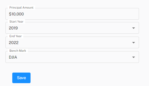
Now that we have a basic understanding of how a form component and its input components can be defined in React, let’s take a look at a real-life example. In this case, I’m taking from an open-source project I’ve been working on that allows users to backtest their stock portfolios against a benchmark (such as the S&P 500). You can see the project here.
Using the Form Component
The following is an excerpt from my web.portfolio-analyzer project in Github:
import { Typography, Grid } from '@mui/material';
import { FormSelectInput } from 'components/form/form-fields/form-select-input';
import React from 'react';
import { useState } from 'react';
import { Form } from '../../components/form/form';
import { FormTextInput } from '../../components/form/form-fields/form-text-input';
const handleSubmit = (principalAmount: string, startYear: string, endYear: string, benchMark: string) => {
const header = 'Submitted!\n';
const principalAmountStr = `principalAmount: ${principalAmount}\n`;
const startYearStr = `startYear: ${startYear}\n`;
const endYearStr = `endYear: ${endYear}\n`;
const benchMarkStr = `benchMark: ${benchMark}\n`;
const message = `${header}${principalAmountStr}${startYearStr}${endYearStr}${benchMarkStr}`;
alert(message);
};
const PortfolioBuilder = () => {
const [formPrincipalAmount, setFormPrincipalAmount] = useState('');
const [formStartYear, setFormStartYear] = useState('');
const [formEndYear, setFormEndYear] = useState('');
const [formBenchMark, setFormBenchMark] = useState('');
return (
<React.Fragment>
<Typography variant="h1" gutterBottom>
Portfolio Builder
</Typography>
<Form
handleSubmit={() => {
handleSubmit(formPrincipalAmount, formStartYear, formEndYear, formBenchMark);
}}
>
<FormTextInput
id={'principalAmount'}
label={'Principal Amount'}
value={formPrincipalAmount}
onChange={(e) => setFormPrincipalAmount(e.target.value)}
/>
<FormSelectInput
label={'Start Year'}
menuItems={['2019', '2020', '2021']}
value={formStartYear}
onChange={(e) => {
setFormStartYear(e.target.value);
}}
/>
<FormSelectInput
label={'End Year'}
menuItems={['2020', '2021', '2022']}
value={formEndYear}
onChange={(e) => {
setFormEndYear(e.target.value);
}}
/>
<FormSelectInput
label={'Bench Mark'}
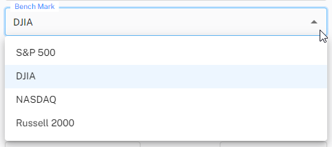
menuItems={['S&P 500', 'DJIA', 'NASDAQ', 'Russell 2000']}
value={formBenchMark}
onChange={(e) => {
setFormBenchMark(e.target.value);
}}
/>
</Form>
</React.Fragment>
);
};
export default PortfolioBuilder;
Here is a picture of the form rendered on the screen:
For each form element, we keep track of the current state and changes using React state hooks.
const [formPrincipalAmount, setFormPrincipalAmount] = useState('');
const [formStartYear, setFormStartYear] = useState('');
const [formEndYear, setFormEndYear] = useState('');
const [formBenchMark, setFormBenchMark] = useState('');
The value for each input element is tied to the state, and each onChange event calls the setX function for updating its corresponding state.
                <FormTextInput
                    id={'principalAmount'}
                    label={'Principal Amount'}
                    value={formPrincipalAmount}
                    onChange={(e) => setFormPrincipalAmount(e.target.value)}
                />
                <FormSelectInput
                    label={'Start Year'}
                    menuItems={['2019', '2020', '2021']}
                    value={formStartYear}
                    onChange={(e) => {
                        setFormStartYear(e.target.value);
                    }}
                />
                <FormSelectInput
                    label={'End Year'}
                    menuItems={['2020', '2021', '2022']}
                    value={formEndYear}
                    onChange={(e) => {
                        setFormEndYear(e.target.value);
                    }}
                />
                <FormSelectInput
                    label={'Bench Mark'}
                    menuItems={['S&P 500', 'DJIA', 'NASDAQ', 'Russell 2000']}
                    value={formBenchMark}
                    onChange={(e) => {
                        setFormBenchMark(e.target.value);
                    }}
                />
For every new form input placed, you’ll add a new state hook to keep track of the current value of that input and tie updating that state hook to the onChange event for the corresponding component.
Lastly, I implemented a handleSubmit function that we then pass into the form component. Here is the handleSubmit function that will get called when the user clicks the “Save” button after filling out the form:
const handleSubmit = (principalAmount: string, startYear: string, endYear: string, benchMark: string) => {
    const header = 'Submitted!\n';
    const principalAmountStr = `principalAmount: ${principalAmount}\n`;
    const startYearStr = `startYear: ${startYear}\n`;
    const endYearStr = `endYear: ${endYear}\n`;
    const benchMarkStr = `benchMark: ${benchMark}\n`;

    const message = `${header}${principalAmountStr}${startYearStr}${endYearStr}${benchMarkStr}`;

    alert(message);
};
Because this is not wired up to an API at the time of this writing, and also for just demonstrating a simple example, this just displays an alert with all the values the user selected for the form. Normally in this function, you would send some kind of request to a backend API that handles the form submission.
This function is passed as a prop to the form component which ultimately triggers when the “Save” button is clicked.
<Form handleSubmit={() => {
    handleSubmit(formPrincipalAmount, formStartYear, formEndYear, formBenchMark);                        }}>
{/* Form Controls */}
</Form>
Conclusion
Building forms for user input in React is pretty straightforward. This is a very general example, and you may find that for your needs you’ll need to modify what you have to better match your situation. This article did not go over validation (i.e.: ensuring that required fields are filled out) and did not cover some of the additional constructs for adding adornments to inputs. The basic examples in this article does provide a pattern to follow and adapt for building forms in your own applications.